Camera slider
 Sunday, January 19, 2014 at 02:11PM

 camera slider in
  model making,
  the future
  Watch all my videos on Product Tank TV
A product design blog containing unique observations, advice and ideas to improve objects from the mind of Product Tank.
 You can subscribe to receive my future blog posts by email, each time I publish new content - just click on the orange RSS symbol (on the right) and you will be taken to feedburner.
 Sunday, January 19, 2014 at 02:11PM

 camera slider in
  model making,
  the future
  Monday, December 16, 2013 at 03:08PM
 I see lots of student work which looks amazing, but I know cannot be manufactured. The problem is a lack of time or care, where the designer has not made a model to test their idea (maybe a model is not part of the grade criteria). I want to address this, because I am noticing this trend increasing. So I thought about making an instructional video for students. Then I heard the Baz Luhrmann sunscreen song and wanted to use it as the inspiration and the idea went from there. Please watch the video.
The narration:
> Students of product design - make models.
> I have seen hundreds of portfolios, where students have been too quick to use CAD without first testing their ideas to see if they will work.
> The long term benefits of making models to quickly identify and solve problems has been proven by product designers over and over again. The rest of my advice is purely opinion. I will deliver this advice with a large nod to Baz Luhrmann, now.
> Design is a journey, when you begin a project you should not know what the end destination looks like. Do not be in a rush to get to the final solution. Get lost, go down many paths and enjoy what you discover.
> Always go too far and then come back.
> Research, know your audience, walk a mile in their shoes and if you can't, try to understand all the nuances surrounding who you are designing for and what you are designing.
> Never stop asking why.
> What ever you design, always try to make it new in some way.
> The brief is king, challenge it, exceed it, but you must answer it.
> CAD is only one tool, currently it cannot tell you how something feels or behaves in your hand or how heavy or uncomfortable it is in use.
> A pretty picture of a design is not a product.
> Take things apart, you cannot hope to improve anything if you don't know how it works.
> If you take a found object and put a light bulb in it, you are just up-cycling.
> People say you are only as good as your last project, rubbish! You are only as good as your next project because of everything you have learnt. Make lots of mistakes and learn from them.
> No real good has come from forcing anything, take regular breaks. Never think, 'that will do'.
> Don't design to make money, design because you care and trust me about making models.
 make models,
  video in
  model making,
  product design advice
  Sunday, December 8, 2013 at 03:53PM
 I've finally managed to upload the video of my improved chopping board/bowl design. Its interesting how one idea can spurr another, the design can easily be adapted to become numerous other objects, such as a dust pan or a wheel barrow. I chose to have a crack at the wheel barrow for my next project, with a sneak peek at the end of the video on progress so far. Please have a look, I hope you enjoy it.
 cchopping board in
  prototype
  Sunday, November 10, 2013 at 10:42AM
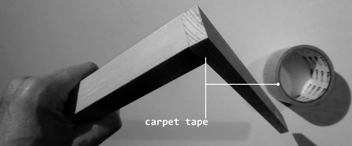
Oh, where would I be without carpet tape. If you want to make quick models without having to wait for glue to dry, the double sided sticky stuff is invaluable. I use it on practically every product design project, even if it's just to hold two pieces of wood together whilst I'm cutting them, so I get two of the same shape without having to draw and cut it out twice. To hold things in place whilst you screw them together or assemble a model, its invaluable. Easy to use and apply, it sticks like the brown stuff to a bed sheet! I should have shares in it, it's my top model making cheat.
 double sided tape,
  top tip in
  model making
  Thursday, November 7, 2013 at 03:57PM
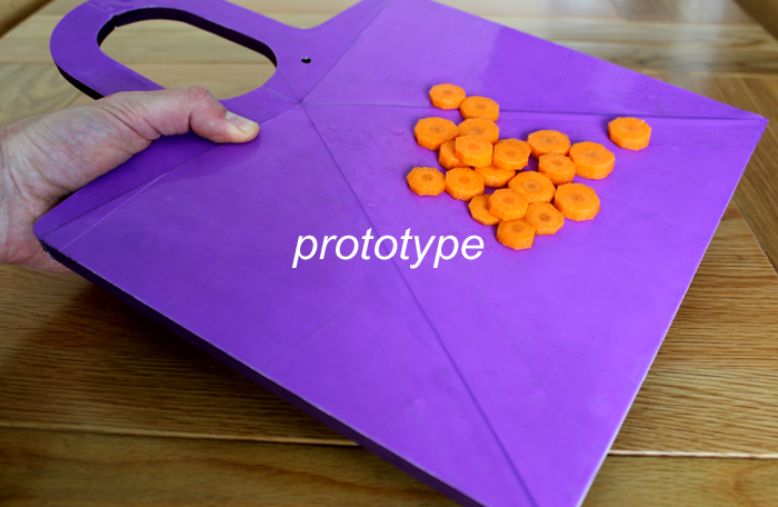
I've been a bit quiet of late and soon you will see why as the latest project is almost finished and ready for launch. No prizes for guessing its a chopping board, but there's a bit more too it than that.
 chopping board in
  concept,
  sneak peek
  Thursday, November 7, 2013 at 03:42PM
Lots of people assume they need a lot of equipment when model making, but actually you can get by with very little equipment (good power tools are a great help). When I was in university there was a fantastic spray booth with water wall, turn table and fan system. But despite the fact that it was a joy to use, the spray results that I acheived are no different to my current high tech system, which is newspaper, two strips of wood to counter wind and an empty bit of space. A few things to consider though...Try not to spray below about 8 degrees C and ideally spray over 10 degrees C. Make sure humidity is as low as possible and what you are spraying is dry and even though outdoors, always wear a mask and work out wind direction before you spray to avoid accidents!
 Tuesday, November 5, 2013 at 05:29PM
I have previously lamented the use of the word 'Genius' being bandied about far too often and used to describe things that are about as far away from Genius as I think it's possible to get. This week I feels I cannot read through a product description in a catalogue without encountering the word 'Revolutionary'. Whilst I accept that products have to be described to help them to be sold and positive words are far more likely to aid this goal, very few of the products I have recently seen described by this term get close to being revolutionary. Just drop the 'R' and you will get what most products actually are, evolutionary. Taking a product that has existed in various guises for over 100 years, making a change to the material or tweaking one design element is not revolutionary. The products are too numerous to mention here, but you know who you are!
 revolutionary in
  observations
  Thursday, October 3, 2013 at 04:19PM
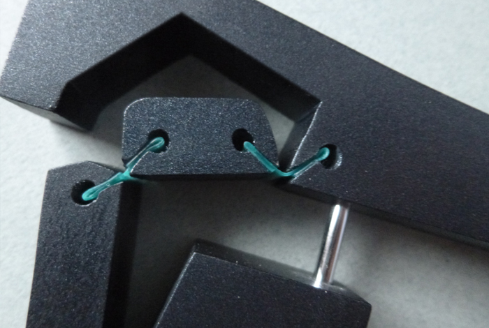
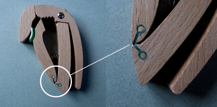
Many times I have a design that I want to have a live hinge. The easiest way I have found to prototype live hinges when making working models is to slot thin strips of polypropylene into slots cut into my model. By drilling holes first, then cutting a slot leading into the hole, I can easily control the depth of the slot and also have a means of pushing the polyprop hinge out if you want to make adjustments. Its important to select the right saw blade thickness to polyprop thickness (I find a junior hacksaw blade works best) and then double the polyprop up. For added security you can also push pegs into the holes. In the images of a pan lid locking handle (above) and clothes peg (below) the main material used is beech wood, with pieces of bamboo skewers used to lock the polyprop in place and pull the hinge taught on the clothes peg.
 live hinges,
  model making in
  model making,
  process
  Saturday, September 28, 2013 at 10:34AM
I bemaon the ammount of time it takes to do anything good or worthwhile. Everybody wants everything faster and I'm no different to the next person. I guess its because what ever it is, human nature is to want more of it, for me at the moment it's more views on youtube, better ideas, to build more designs faster. For good and bad reasons, I'm glad that this is not possible, I have 1000's (well, definitely 100's) of ideas, just sat in sketchbooks waiting to be realised. But I know they would only be considered half the idea and that I would be doing them a disservice if I didn't spend lots of time developing the design, making the model as well as I can, presenting it properly, telling a good story to go along with it, showing the thought and the implimentation. Like all good things, this take time.
I design when I get a chance on weekends and evenings as during the week I have a full time job. Currently I am trying to not rush to finish: a set of kitchen utensils, a fridge, a bicycle lock, and a wheel barrow, whilst trying to learn to be more patient.
 patience in
  observations
  Sunday, September 8, 2013 at 04:13PM
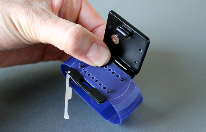
I have finished the last piece of work I will do on the series of watch concepts I've been working on. It's been an interesting project, I could go on, but I feel I have pushed the project far enough. Using my check list, I've taken the materials I have as far as I currently can although with the aesthetics, I could go on forever. The innovative closing mechanism still needs tweaks, but I think I have proven it can work. The last prototype was made in wood with plastic and metal work and sprayed with car body paint. To watch (ha ha) the whole story, please go here.
This week Samsung released their first smart watch, the Galaxy Gear. I still think watch screens are too small for surfing the internet and reading emails. It even has a camera and can be used as a phone. I think it's trying to do too much, but what do I know. These days everything is decided by sales figures, so we shall wait and see.
One thing I have though about with smart watches is if they would be to help people with alzhimers. Could family members set a calendar that is displayed on the watch to help remind sufferers about comon tasks they need to do?
 Monday, August 26, 2013 at 04:02PM
 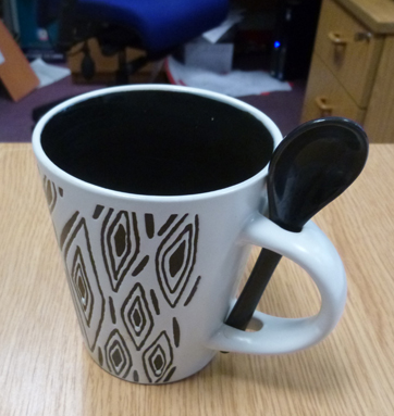 One of my colleagues has bought a new mug that has a spoon that slots into the handle. I thought the mug was a bad design, but she and everyone else in the office loves it (they are all ladies who are not from a product design background). So numerous discussions have been had; I have tried to convince them why this is a bad design and they have defended it, not surprisingly, Product Tank has been outdone by lady logic.
1. The handle could be weaker than a standard design.
Response: I'm not swinging it around the room, it will be fine and if not, I can just buy another one.
2. The spoon when used and returned to the handle will drip liquid down the handle and over your hands.
Response: Just lick the spoon or preferably, wash and dry it.
3. When you drain the cup, by tipping it back, the spoon will fall out.
Response: This hasn't happened so far.
4. The inside of the cup is black, so you can't guage the strength of the tea you are brewing.
Response: She's using coffee sachets which are already pre-measured, or if you are making tea, you could just put the milk in first. (I did argue that putting the milk in first will reduce the temperature of water, which will effect the quality of the brew when putting a bag in the cup)
The killer blow was the argument that spoons go missing in the office, so having a unique spoon that you can keep with the cup is a really good idea. Shows what I know!
If I was designing another mug, I would have dismissed this idea very early on. Its a useful reminder about how important it is to know and understand the needs of your customers prior to commencing a project. It's also a reminder that no matter how bad something is, if someone loves it, they will not see or will adjust to cope with its faults (or they just like an argument!). When making tea for my colleagues the other day, I used this spoon to stir the coffee, then placed it back into the handle and on picking up the mug, scolded myself on the spoon. Ladies 2 product tank 0.
 cup,
cup,  market research in
  observations
  Monday, August 26, 2013 at 03:56PM
 I always use a mental checklist that I run through on each design project, but since the car, I have decided to create and use a written one to go over during and just before the release of each project. This is my initial list, that I will refine as time goes on. Every project can be developed a little further and it's not until I have released a project and been given feedback that I can come up with new ways to improve, but this list is to help get each project as far as I can first. Hopefully it will help you too.
Beginning:
Have I come up with a brief or idea for a solution to a problem that doesn't exist?
Have I done enough research?
Is this a concept for the sake of it?
Can the problem be solved another way?
Solutions:
Does the design idea address the need/problem sufficiently?
Has it been designed not just engineered?
Have I pushed the design far enough?
Am I churning out the same things as everyone else? Or is it being different for difference sake?
Is the detailing good or refined enough for each individual area on the concept?
Is there a balance between simple and complex areas?
Have the materials been properly considered?
Can it be engineered to be more environmentally friendly? (this will require a sub checklist)
Have textures, colours and finishes been properly considered and pushed far enough?
Packaging where applicable?
Does the solution provide real benefit?
Is it too gimmicky - Does it have a very low gimmick rating?
Is it innovative in its size to complexity ratio.
Have I made everything thin enough, light enough, have I pushed the materials to their limits.
Publishing/presentation
Does it look cool in the images, is the quality as high as I can get it?
Does the presentation tell the story to someone not familiar with the project?
 check list,
  checklist in
  process,
  product design advice
  Saturday, August 17, 2013 at 02:30PM
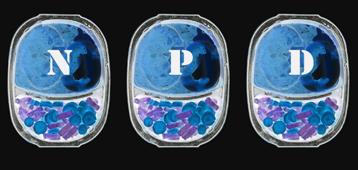
We product designers (even though it's not what I do to earn my crust, I still have a product designers heart) are a relatively rare bunch, that is to say that compared to graphic designers etc we are in the minority, but we are still here. So when searching for jobs, how irksome it is to look at lots of job listings that say 'designer wanted' to then visit the description to find the company want a graphic designer or a costume designer or any other designer other than a product designer. The latest is jobs advertised for NPD. Not so long ago, NPD (New Product Development) seemed to be mainly focused on product design. Now NPD seems totally related to designing and working within the foods industry, creating the latest ready meal. Since when did the food industry bag it and why can they not call it something like NPDF. There are so many disciplines that have designer as their following word, costume, set, graphic, car, lighting, to name but a few. Why can’t the people writing the job descriptions not be more specific. Surely this would achieve a better hit rate in terms of applicants as people scanning the job listings would know exactly what the job advertised was for? Ok rant over.
 adverts,
  design,
  job in
  business advice,
  observations
  Thursday, August 8, 2013 at 09:21AM
My watch design has been featured on the front page of Core77.com, with a discussion in the project forums about if the method for fastening the watch strap to your wrist is innovative as I hope, or if it has been done before.
 core77,
  featured,
  product design,
  watch in
  review
  Tuesday, August 6, 2013 at 11:19AM
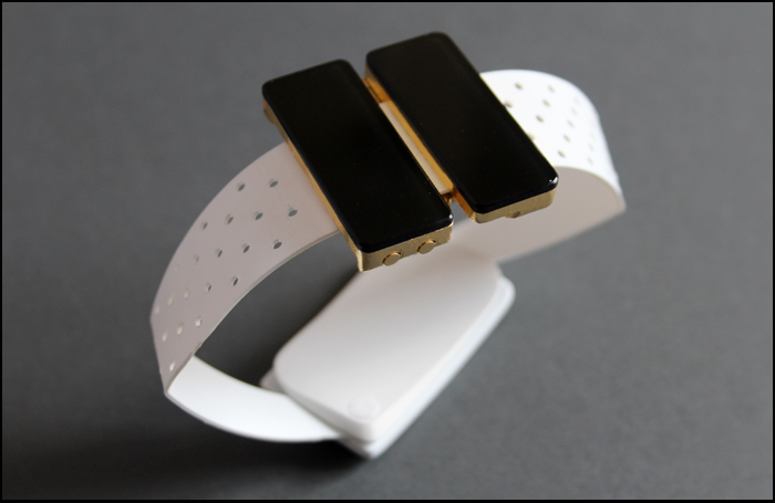
I have finished my watch project. I say finished, what I mean is released, because especially now, at launch, I can see lots of things I'd like to tweak, but for now it is done. It was quite an enjoyable project, I think mainly because (after the car) I was working on something small, but I enjoyed making lots of models and getting back into the design process.
Recently I've been musing about this. As a product designer, I think you have to be in love with taking journeys, not necessarily worrying about the end destination. If you enjoy the journey, where you eventually arrive will be good. If you only focus on the end destination, not exploring all the avenues and pathways, where you end up will not be as strong, simply because you willl have not travelled as far (and probably taken a few short cuts to get there!). I'm not saying my watch project is great or I'm at the end of the journey, but I like the analogy.
 watch in
  model making,
  process,
  product,
  prototype
  Monday, July 22, 2013 at 05:24PM
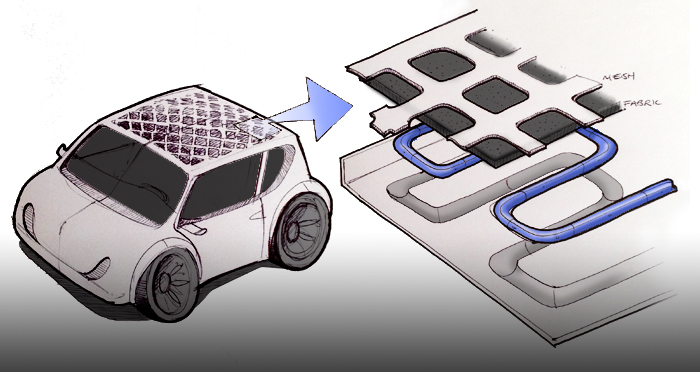
 idea,
idea,  materials app,
  process in
  concept,
  ideas,
  the future
  Saturday, July 6, 2013 at 05:12PM
When I started designing my car, I researched the market and what was already available and researched the functional problems elderly drivers experience with cars to inform my design. I consciously chose not to address these problems using electronics, mainly because I believed that mechanical solutions could work as well with less chance of breaking and at a reduced cost. (In particular the wing mirrors). I was wrong, the solutions to the problems already exist in a much better way, electronically, with parking sensors and cameras that give you a 360 degree view of the vehicle, they are currently only available in top of the range vehicles, but they are the ideal solution to the problem. So, should I be designing the best solution, or the most affordable one. I suppose that depends on the brief, but who am I to say whether people can afford things or not, there are plenty of payment schemes available. Why should I be diluting the strength of the design at answering the problems I've identified, based on my experience of how wealthy the elderly people I know who would benefit from such a design are. The answer is I shouldn't, I should have used the latest technology, as long as it is of benefit and not gimmick, because it will surely come down in price but most importantly because it is the best solution. That was lesson number 1.
 analysis,
  car design,
  mistakes,
  review in
  failing,
  observations,
  process
  Saturday, July 6, 2013 at 05:10PM
 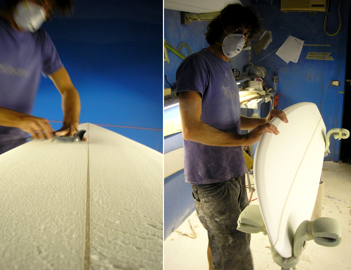 Surf Board shaper Neil Randall (if6was9) at work
 Saturday, July 6, 2013 at 05:06PM
I have a small pond that is currently the colour of pea soup and i'd like it to be clear. I have a UV Light on the pump outlet, but it doesn't seem to be reducing the green (yes I've checked the bulb). So, this weekend, I decided to go all Heath Robinson on it. I have a load of stainless steel mesh, left over from other projects (originally my kettle design). I've used it before to filter bits out of wine, so I thought I'd make a set up to try and take some of the sediment out of the water. The rig I built works really well for a while, tiny bits ofsediment build up as they hit the mesh and are pushed to the sides by the pressure of the water, but aftter about an hour or so, the build up gets too great and rather than go through the mesh, the water spills over the sides. So, I've been thinking of improving the design to incorporate a water wheel, driven by the fall of the water to brush the sediment that builds up into a collection area. This is only the first stage, this is the product design process in action. I have identified the problem, almost have a working solution, but it still needs the design process to make it into a realistic object.

 design ideas,
  model,
  pond filter,
  prototype in
  ideas,
  model making,
  prototype