Watch all my videos on Product Tank TV

Receive an email update when Product Tank launches a new project

Powered by Squarespace

A product design blog containing unique observations, advice and ideas to improve objects from the mind of Product Tank.

 You can subscribe to receive my future blog posts by email, each time I publish new content - just click on the orange RSS symbol (on the right) and you will be taken to feedburner.

Sunday
Jun302013

Model making is not really a hobby, more a way of life. I'm always looking for materials to store for future models.  I have boxes and boxes of plastic parts and scraps of material, it becomes habitual to look at everything I am about to put in the bin, just to check if I can't think of what it could be useful for.  So recently I have become very interested (possibly slightly obsessed) with the packaging that comes with raw meat.  The plastic boxes that hold your chicken thighs and wings are full of amazing patterns, useful for all sorts of model details, handgrips, watch straps or if you have kids, making superhero body armour.  The possibilities are endless, (I wish I had found this when I was working on the head lamps for my car) just make sure you wash it thoroughly before re-use!

Sunday
Jun302013

Product colour of the future

My parents recently repainted their kitchen and my mother, who is famous for her lack of artistic talent, chose the paint colour, a cool grey (although can it be called a colour?).  I have to say, she's pulled an absolute blinder, as the grey she has chosen seems to compliment everything put against it incredibly well.  So it got me thinking, as I have said in previous posts, eventually our current obsession with black or white products will wane, so what then?  I would suggest this and will be using it in the not too distant future.  The future is bright, the future is grey!

Thursday
Jun272013

Blue Sky design contests

I was recently very derogatory about the latest Electrolux design lab finalists who submit blue sky design concepts under themed categories.  The concepts selected this year do not seem to be as strong as previous years.  I cannot understand why they were presented (without a reality check from tutors and peers prior to submission) and why the judges decided that they should be selected.  This is not me trying to knock student work, I only want to support students, but I believe you never learn as much from positive comments as you will from constrictive criticism.  

For this years competition, Students could submit work under three categories, one of which was air purification.   I do not wish to single anyone out as I think they were all bad, but as an example, no matter how far into the future you go, I cannot see how an air purifier the size of a match box worn on the wrist outdoors, can work.  Just mathematically, anything that small could not shift the volume of air necessary to improve air quality in an outside environment effected by wind especially when you factor in the distance it will normally be from your face.

I have strong views about blue sky work, I did a lot of it when I was in university and I enjoyed it, but now I question how much value it has.  Blue sky as I know it, is looking at what scientists and engineers predict will be the future in 10-20 years time and designing objects that take these things into consideration.  Looking back at the work I produced, most of the technology that 15 years ago it was predicted we'd have today, has either not come to pass, has been superseded, or just wasn't adopted by the public.  What I'd designed would have been difficult or impossible to manufacture and is still worthless 15 years later.  Whilst I had fun, I didn't really learn as much as i would have trying to design objects that could be manufactured.   I was not trying to be practical, that's not what blue sky is about. So, foolishly I adopted a blinkered approach, which I fear anyone designing objects with Blue Sky thinking is prone to do. As as soon as you hit a design barrier it is all to tempting to get around the problem by assuming, that in the future batteries will be as thin as a human hair with enough power to last a life time and motors the size of a fingernail will have enough torque to drive a car. Lights will be infinitely bright and everything will posess the ability to hover and think for itself.  Now I think the term blue sky is used as a way of covering up bad design and its lazy.   The blue sky pieces I designed were not really good for my portfolio.  What did they tell prospective employers? This designer has no idea how to package existing technology into something feasible- if you employ him, you will have to retrain him to produce things that can be made.
I'm not saying designers should not design for the future.  Most designers are designing for the near future, because it takes months to finalise tooling, approve 1st off production samples, manufacture stock, ship that stock to a store and put it on shelf.  Six months or more could have elapsed from the concept to selling the first product and in that time fashions change, tastes swing.  A designer is not designing for now, they are designing a little way into the future, but not the future in 10 or 20 years time, what would be the point.  I remember watching old episodes of Star Trek in which the set designers tried to make a version of the future, how dated it looks now and how irrelevant.  Even the films today with all their special effects in 15 years time will be inaccurate.  You cannot predict the future, it's impossible and so, in my opinion, unless you are a set designer on the next sci fi epic, blue sky design and the concepts selected for this years Electrolux design lab contest are largely a waste of time.


Sunday
Jun232013

Advice to product design students - you won't realise how lucky you are.

The university I went to had a fantastic wood working machine shop, with table saws, lathes, bandsaws, thickness planers, mortisers, circular sanders, routers etc you name it, it had it.  There was a metal working shop with 3 different types of welders, various saws and tube benders, metal cutters and metal lathes. A huge ceramics area with everything for slip casting, throwing and glazing, with a kiln our tutor rather worryingly told us could fit the body of a large man standing up! It had vacuum forming machines, an enormous ply laminating machine, a spray booth with water wall (that I managed to flood on 3 occasions). The list could go on and then, I graduated.  I was fortunate enough to get 3 months in Italy working for a design consultancy as part of an exchange scheme.  Their office was in an apartment block and they didn't have a workshop.  In stark contrast to university, cardboard, wire and a pair of scissors was about as good as it got.  Then I worked in a consultancy in the uk and was lucky that they had a work bench and a bandsaw in a garage.  
My point is, if you are in university and like making models, make the most of your time there as unless you are very lucky, you will probably never be able to get your hands on as good or varied equipment again.  Also, what I didn't appreciate whilst I was at university was the amount of time I had to use and gain experience on these tools.  The majority of students in university have soo much time to focus on design, even if they think they don't.  What a luxury having the amount of time I had then would be today.  The older you get the less time you have, even if you are employed in design there isn't the time to spend days playing around making models.  I don't yet have a wife, kids or a dog and finding any time is still a struggle.
Sunday
Jun232013

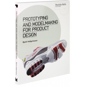
prototyping and model making for product design - book review

I was given the book 'Prototyping and Modelmaking for Product Design' for Christmas.  Since then I've been referring to it.  Many of the processes and techniques I already use on many of my projects, but it is a great resource especially for students or those new to making models for product design. It covers lots of processes many of which i didnt know much about.  I suppose in some respects I wanted to check if the techniques that I've been using could be improved or were out of date as I am quite a traditional model maker, due to the availability of materials and resources, (we'd all like a rapid prototype machine, but one is currently out of my price range).  I have developed lots of techniques to get around not having the right tools, or to do things more cheaply or reuse what I've got.  But for the whole overview, from the professionals, this book is really good.

Sunday
Jun232013

watch - sneak peek

So as I may have mentioned, here is the first sneak peek at a series of watches I am currently working on.  I'm a great believer in balancing details when designing a product, so if one area is complicated, another should be clean etc.  With this watch, as the body is very plain, I thought the strap should be interesting.  As a quick concept model it's ok.  I'm a great collector of stuff for model making, so the watch strap is made from the packaging you get when you buy a supermarket chicken (in the Uk) for the Sunday roast - it looks quite good on the wrist and the chook was delicious!

Tuesday
Jun182013

old skool Design ideas - lamp

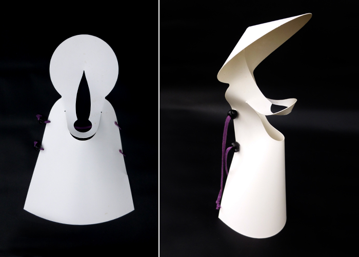
When I was in University, during a very short project I designed and made a prototype for a fold up table top lamp body that gripped a bulb and socket.  The design was one piece, made from polypropylene and whilst it looked (in my opinion) quite cool, it was actually fairly unstable and due to the materials and shape, too light weight to be safe.  The reason for posting it here is because it's been sat in a cupboard for about 15 years, but now I need to recycle the materials for another design project I'm currently working on, a series of watches, so just before it is gone forever, sacrificed for the greater model making good, I decided to record it for posterity.

Tuesday
Jun112013

Oh no, Another blog post about a chair design

I am in the minority here, but I cannot believe how many people press the ‘like’, ‘appreciate’, thumbs up, high five, secret handshake or any other form of positive rating button used on industrial design websites for a mundane chair.  I cannot believe how many of the product design websites I regularly visit blog about chairs, we are drowning in posts about chairs (ironically, this is another one).  My initial beef was with the plethora of similar chairs being designed.  On an almost daily basis there is another image of the latest and greatest chair design, I’d look at it and think – ‘4 legs, seat, back, wood..yep it’s another chair, similar to the one I saw yesterday (slightly different colour, slightly different shape) and yawn, the day before and the day before that and Zzzzzzz.’ 

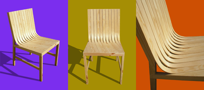
Then I looked at my own chair designs and realised…. ‘4 legs, seat, back….ah.’   I remembered how much I learnt designing and making the chairs I’ve designed and how useful those lessons and the chairs themselves have been.  So I changed my mind, we should not stop designing chairs, just stop blogging about them and stop liking them.  The thing is, chairs are not difficult to design, Phillipe Stark claimed he could design a new one in 2 minutes.  Imagine if all the design effort across the globe that has been put into designing chairs was channelled into solving real problems, would we be further on? 

I’ve seen amazing product design concepts on websites that have ‘appreciate’ buttons, that are used as a gauge of how the public rate the design idea, styling etc.  There are some absolutely brilliant ideas that only get a handful of ‘likes’ yet a plain 4 legged, 1 seat, 1 back rest, wooden chair gets thousands of appreciations and if you stick an arm rest or two on it - wow.  I cannot understand why these designs receive so much attention at all, where is the demand coming from.  Don’t get me started on tables!

Tuesday
Jun112013

Universal design process Q and A with Maren Fiorelli

A while ago I responded to a series of questions about my design process with Maren Fiorelli,
a design student at Columbia College, a slightly edited version of some of my responses is here:

1. What is the first thing you think about when beginning a project?

Once I have identified something I’d like to tackle – a product that I think I can improve on or an area that needs improving, I research to see if this hasn’t already been done, as something better may already exist, but it just hasn’t become mainstream enough to hit my radar and there are few things worse than spending lots of time on something only to have someone tell you that they saw the same design idea or product 4 years ago. 

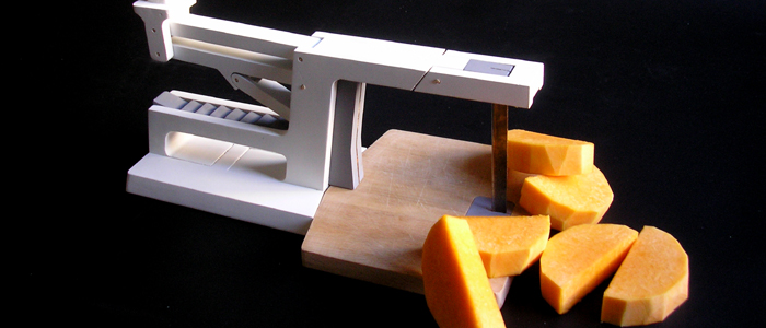
As an example, my Nan struggles to chop vegetables because of weak wrists, as a designer, should I design a better chopping gadget, or order packets of pre-chopped vegetables from the supermarket?  There is always another way around a problem, sometimes this is an advantage as it allows you to break away from the norm, other times it is a disadvantage as it means the problem doesn’t really exist.  So I have to carefully consider if something is worth tackling as it’s quite an investment of time.  I don’t get it right every time either and I do come up with a lot of dead ends. As the image in this post and  this video demonstrates:

2. What are some key elements that you try to emphasize in your products?

It’s all about functionality.  I have my own design style, but looks are not really important to me, which is weird coming from a product designer as of course I don’t want it to look butt ugly, but one man’s duck is another man’s swan – aesthetics are down to individual taste.  If I had to choose between sacrificing looks or functionality, looks would get the chop every time – although I do think the role of the product designer is to balance both.  What I am really looking for is an elegant solution, the solution which performs best in the most economical/simple way in terms of materials, functionality etc.  It’s hard to describe but you know it when you see it.  I will also always try to first solve the problem without using any (electronic) technology as I feel it’s always the most obvious path, too often designers will just stick a motor in something or a bunch of electronics. 

For example, recently my mother was moaning because the battery had died in her electronic weighing scales, so she had to go back to her mechanical ones – they work perfectly and will continue to do so long after the battery in the electronic ones has died – if electronics provide a tangible benefit, then they should be included, but often I feel it’s an example of laziness on the part of the designer/marketing department and a needless use of resources to try and get a sale from a public that have been tricked into thinking they need something new – new is not necessarily better.

3. How do you create your master check list for these key elements?

I always create a list of things that I’d like to include, there’s the ‘nice to haves’ and the ‘must be able to do’s’.  I (sort of) imagine everything it would be good to have, even if they may be currently impossible, but I think through as many scenarios as I can.  Some ideas I put back on the shelf for next time, but all the things that will make the object better, I try to keep.  It’s difficult to put into words quite how it works, but I try to include as much common sense as possible.

I also use a rule of thumb for the size of product I’m designing to try and include as many innovations/USP’s (unique selling points) as possible.  If what I’m designing is simple (1 part) like a bread board, I’m looking for at least 1 USP.  If it’s a complex product then I’m trying to find at least 7 USP’s to make it stand out.  These USP’s should not be bolt-ons, so the thing looks like an extra out of the transformers movies, but must be incorporated into the design to add to the functionality as I believe there is no point in being different just for the sake of it when you can be different to the benefit of the product and the consumer.

4. What do you feel about universal design in relation to products for someone with a disability?

There are certain disabilities that require unique and adapted designs tailor made to the individual.  What I like most about the principles of universal design is that by making an object as easy as possible to use for the people who would find it the hardest, you improve it for everyone, which has to be a good thing.  If everyone is using the same equipment, then it’s one less barrier to being disabled.

5. I see that function is the most important aspect in your designs. How important is it to you to stay within the social norm for products that you create?

There are no revolutions in product design; everything is an evolution on what has gone before.  I want my designs to be easily understood and used.  I do not want to design objects that require massive instruction manuals.  So to a certain extent I am designing things that I hope look familiar, but maybe have an element of surprize, like my pepper mill who’s lid turns into a funnel.  I am not looking for people to buy or use my product designs because they are by me (otherwise I would show my face on my site etc which I never do), I would like what I create to be invisible, which means, I want my products to work so well that people don’t notice them.  The majority of products function to complete a task – I use a can-opener to open a tin of beans, not because I love opening tins, but because I am hungry.  When the can opener doesn’t work I get frustrated, because it becomes a barrier to achieving my goal.  I never want my designs to be barriers.  All products follow some form of social norm, they are styled for which-ever culture will most appeal to the consumer, which is why so many versions of a product exists.  Even something as mundane as a toaster comes in many forms and colours to fit with the styling of your home.

6. What direction do you think that designers tend to overlook when they are designing products?

Mainly I would surmise that most mistakes that are made are caused by aggressive time constraints. Time is money, so there can be extreme pressure to hit a deadline.

I have direct experience of this.  I once designed a garlic crush as part of a range of kitchen utensils.  I made a solid Bluefoam model that was then realised in CAD and a rapid prototyping model sent back. I, the client and the rest of the office had a look at it and everything seemed ok, but no one tried to crush garlic with it as we would have broken the part.  We pushed on with tooling, but on receiving the first off tool samples, I discovered (to my horror) that when crushing garlic the two handles just slightly pinched the skin in people’s hands when fully closed.  Changing the tool was costly and no one was very happy, but due to aggressive timescales it was a mistake that no one spotted.  I learnt a lot that week;-)

Monday
Jun032013

Almost turning 'Hulk' and Peter Dormer

The button on my I-pad stopped working; I tried pressing the button a few times, nothing.  My father, having seen all this, thought he could do better – despite his age and technical incompetence, it appears it’s a parent thing.  ‘Give it here’ he said, stabbing his thumb onto the button until the skin under his thumb nail went white – twice!  He turned it around, looking for something else, the ‘push here to fix everything magic button that only appears when something goes wrong,’ but unsurprisingly it wasn’t there.  He shook my I-pad and stabbed the button again.  ‘Nope, it’s not working,’ he said handing it back.  I’m beginning to experience the same feelings as Peter Banner, just before he rips his shorts, turns green and destroys the house. ‘Oh, so having watched me, you were somehow under the illusion that doing exactly the same thing, after a 5 second delay, but twice as hard would somehow be the ideal remedy – brilliant!  If it wasn’t working before it probably won’t now!’  On calming down, I was reminded of an extract by the late and great Peter Dormer, from his book ‘The Meanings of Modern Design’ in which he describes how we used to feel the need to bash the top of the TV when it went on the blink even though there were no mechanical parts and how interestingly this often worked, enforcing the behaviour.  These days you can’t do this because TV’s are becoming so thin, you’ll cut yourself as it rips off the wall.  Our relationships with objects are changing. I wonder if this behaviour is inbuilt, that the less we understand how something works, the more we resort to shaking it.  Or, having grown up with mainly mechanical items, this is a generational trait that will be phased out in subsequent generations.  Regardless, Peter Dormers book remains an interesting read, even if like everything else it will go out of date.  Despite the lack of a magic button, plugging my I-pad in (even though it was charged) seemed to fix the problem and fortunately, no shorts needed to be torn.

Tuesday
May282013

How to determine potential market size for a product

Back in 2012, I was getting emails from people asking where they could buy the New Rule concept ruler I had designed to help people with visual impairments.  Enquirers wanted to buy them for their children to use in school and to help with exams when questions asked to measure an object on the exam paper in millimetres.  I’ll be the first to admit that I have the business nouse of a dead mouse, so I contacted Ashley Sandeman, because he’s family, is very business minded (he’s written a book on it and has a rather interesting blog) and was thinking of starting up a new business.  In the end we didn’t take the product to market, so I asked Ashley to write this article to explain why.  I think this is an excellent example of how to determine the potential market size for a product you have designed before going to kickstarter etc.  The design and enquiries happened before kickstarter was available in the UK, but there are valuable lessons here for anyone thinking of trying to take an idea to market with a loan, an angel investor, or through a crowd funding platform.

How you determine the “potential market size” when designing a product?  A 5-step approach

Ashley Sandeman:

Step 1 – What do you honestly want?

It’s important before you start anything that you know what you want out of it and are honest with yourself. 

I was looking for a business I could start, which would support me financially and allow me to launch other products leading to the full time employment of two people.  For the sake of argument, let’s say I wanted a £50,000 turnover in the first year.

Knowing what I wanted and being clear about this lead to a series of questions:

  • How big was the potential market for the product?
  • What was the growth potential for the product into the foreseeable future?
  • At what price could the product be sold or what price would it need to be sold and was this realistic?
  • What are the costs of setup including a first production run? (I won’t be answering this here)
  • What alternative products are available?
  • What was the likely uptake of the product?

All of these questions are important to answer, but I chose to focus on the potential market size to quickly highlight any problems.

Step 2 – Determining the potential size of the current market

First the quick way - via a keyword search.  I used this because search engine data is aggregated.  I tried several terms, but as an example, I used the phrase “ruler for visually impaired.”  You can use tools such as Market Samurai to interrogate this data using keywords that reveal daily broad matches, phrase matches, and exact matches (which are best) for your words.  It will also reveal the amount of competition for those words and the number of pages referencing your words.  The Market Samurai data revealed that not only were very few people searching for “ruler for visually impaired,” but (at the time of writing) only 9 pages globally used the same phrase.  There’s nothing wrong with a micro-niche.  There’s a lot wrong with a market that hardly exists.

Now the long route, finding data on market size.  This route will help explain why you see the results from the keyword research.  I Google searched visual impairment sites until I could find data on visual impairment in school children.  Not only had the contacts Product Tank received from people referred to school children, but He and I also felt this was the best group to approach.  When we considered professions that used measurement there was always a better/more accurate alternative to the product.  For example, engineers use computer models, digital callipers etc.

From a 2008 NHS (National Health Service) paper I found, the majority of people registered visually impaired in the UK are over 65.  Under 18s make up just 4% of the group.  Assuming 5-17 year olds would really benefit from the product, of those registered approximately 30% have an additional disability be it physical (most common), mental illness, a learning disability, etc.  Looking at the available research I had to assume from a risk perspective that those with an additional disability would never take up the product.

Admittedly the data was not perfect, but it gave me a UK market size of 4986 potential customers.

In short, the market was looking quite small.  I quickly generated a table in Excel using the data I’d gathered.  Even if I priced the product highly at £9.99 (a large sum for a ruler) I’d need 100% uptake of the market to get close to my target £50,000 of sales turnover (4986 people x £9.99 = £49,858). 

The figure of £49,858, minus expenses would be my profit and my expenses need to account for many things including tooling, manufacturing, CAD, prototyping, fulfilment, storage, accountancy, patents, licences, and wages factored into the process.  In short, the UK market isn’t large enough to support the business - I needed a larger market. 

So using the same techniques I then researched the US and found statistical information that indicated that just 1% of the US market is the same size as 77% of the UK market.  I assumed a similar level of additional disability would occur in the US, but even so this gave a potential market of 383,000 people and I hadn’t yet considered Europe or Asia.


As you can see from my US Excel table, I only had to sell 11,495 units, just 3% of the market at $4.68 to get close to the same target I had in the UK.   Looking purely at market size, things now looked more viable.  The trouble is they weren’t.

I was beginning to determine the product’s price based on a figure I felt I needed to hit.  Price should be based on the value you’re delivering, not on a figure you want to be paid.  That I was leaning towards the latter was an early warning.  I didn’t know the likely uptake of the product, but my search engine research (Market Samurai) had given me an indication.  Despite the market size, people weren’t actively searching for the product in high numbers.  Could it be that many didn’t feel it was a problem that needed solving?

Step 3 - Potential for Growth

As discussed, my research showed that new visual impairment cases make up a tiny percentage of the overall visual impairment figures.  Age is a more likely determinant of poor visual health, and that wasn’t going to be my market.  So after filling the market with a hopefully brilliant product on day one, once I’d reached a peak of initial uptake, the research showed that sales would be in decline from that point onwards.  I know I’m making a lot of assumptions, but this is about getting a good feeling from a morning of research and making a decision to continue or not.  The danger would be that I would always be running the risk of holding either more inventory than I could shift or running production so small I’d have to sell at too high a price.

There are a number of weaknesses with such a brief look at the market.  Even people with good eyesight find reading a millimetre ruler difficult.  Those children whose eyesight was fine, but who also found reading a millimetre ruler awkward may want to take up the product.  There could be a larger market out there than I first thought.  However, there’s a valuable business lesson here too:  It’s easier to sell to an established crowded market than to a new market that doesn’t yet exist.  Creating a new market is very expensive, and I felt at risk of doing that here.  At least in a crowded market you know there are customers willing to part with their money.  Could my market simply be anyone who needs to use a ruler, and my solution to supply them with the best ruler in that market?  The answer here in my view is no.  Rulers with large numbers are available.  So are normal rulers and digital callipers.    I’d be taking on the entire market with a product most consumers didn’t really need at a significant increase in price to a standard ruler (because of the extra parts), without the accuracy of a digital calliper.

Step 4 -, Understand your market, risks and competition

In understanding the UK and US markets my research showed that their education systems have different requirements.  If you don’t understand your customer base you can’t help provide them with value.  The first issue I faced was the metric system.  In the UK we use centimetres and millimetres.  In the US inches are a more common measurement.  An inch is a larger measurement, creating a lesser visual impairment problem.  It also creates a design problem as I can’t sell an identical product in both countries.  This is before I even mention marketing and distributing in the US.  The entire venture would require a lot of viral support from the visually impaired network as I couldn’t hope to cover the country.

Finally I examined the school system.  Again if you Google something for long enough, or speak to the right people you’ll find your answer.  Research can be a pain, but nothing compared to the pain of losing time and money.  The UK school system did not penalise children for being unable to answer a measurement exam question, and such children could be provided with a modified exam paper if requested.  The parents querying the availability through Product Tanks website might not be aware that their children didn’t need it for an exam, and so potentially are not customers.  As for the rest of the world, as my keyword analysis revealed, people did not appear to find it a large enough problem to search for a solution.

Step 5 – Finally, (and most importantly) be honest

After all this I concluded that it was unlikely I would get a return on my investment of time and money.  Helping the visually impaired is a great cause, and the knowledge that the product would be helping people was a clear motivator to bring it to market.  But it would need to be approached from the perspective of philanthropy, not business.  As hard as that sounds I think you need to be invested in this sort of market for the love of the product, and the risks of losing a lot of money was too great for me to adopt it for solely business reasons.  If you’re going to live and breathe your business, you have to love it.

Ashley Sandeman is a business consultant and author of “101 Things I should have been taught at business school.”  You can find his blog here


Wednesday
May222013

design advice - areas to innovate

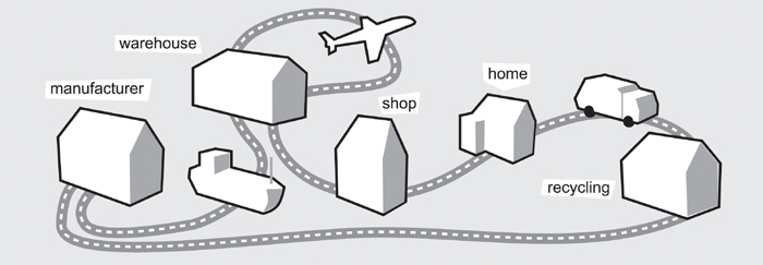
When I am designing a product I often only focus on the products relationship with the end user, without realising all the other areas where I can innovate. Products are manufactured, stored, delivered to warehouses, shipped in containers, displayed on shelves, taken home, used and kept in cupboards, cleaned etc.  The life of a product does not begin when the customer opens the packaging.  If I can save weight, materials, number of parts, size (flat pack), storage, ease of part replacement, ease of dis-assembly, then I am making huge cost savings and environmental savings, etc.  There are loads of areas within product design where a designer can make a huge difference, a long time before it has reached the end user and a long time after and all too often I think this is overlooked.

Monday
May202013

Creative advice

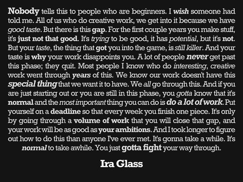
It is very rare that I will post anything on this product design blog that I have not designed, thought or written myself, but every so often I see something that I instantly know, no matter how much time, effort or skill I put in, I will not be able to better.  Quite a few years ago, I saw the quote below and thought at the time how well it encapsulated my own journey.  Then recently whilst trawling the web, it resurfaced again and was a timely reminder for me about perserverance.

Tuesday
May142013

what is industrial design?

There has recently been an interesting discussion on Core77 about trying to define what industrial design is.  Its clear, that at the time of writing, a whole bunch of Industrial designers cannot agree.  Design is such a personal thing and everyones reason for doing it is different.  Some people want to make existing designs look more stlish, some (like myself) want to improve their functionality.

'My industrial design is about identifying a product that doesn't work as well as it could and trying to make it work better.'

But I'm happy to admit, I'm not happy with that definition.

Tuesday
May142013

product design advice - test your idea first

The uncle of a friend of mine came up with an idea for a product; what the product was is not important, suffice to say, it was an idea so commercially bad, it was the chocolate tea pot of bad ideas.  He wanted to take the design to market and with no product design experience, conducted a brief internet search and found an experienced Product Design company offering design evaluation services.  From the website they had all the right bells and whistles and offered to evaluate the design free of charge.  He went along to meet them and they reviewed his idea and surprisingly told him it had legs.  The next step would be for their patent team of highly experienced patent experts to do a search to check if the idea had not already been patented.  My friends uncle, parted with the cash (a princely sum) to allow the initial search to be conducted.  The fee seemed steep, but they assured him that there would be a lot of hand holding along the way and their experts were, well… experts.  Unsurprisingly, the initial search came back with articles of a similar nature, but nothing that was close to his idea (with good reason, his idea was a howler).  For the next stage, the company would prepare various sketches to get rough tooling quotes and patent his idea.  The fees were starting to increase, so my friend heard about his uncles’ folly and put him into contact with me.  A few quick questions were enough.  I felt like Simon Cowell on X-Factor.  ‘Haven’t any of your friends or family told you, you can’t sing?’ 

‘No, they all say I have a beautiful voice’

It didn’t feel good. 

'What do your friends and family think of your idea? Have you made a rough model to see if your idea will work?' I asked, he replied he hadn’t made a model, he had never done any of this before and didn’t really have any DIY skills.  He also hadn’t told many people because he was worried about giving his idea away, but his wife thought he had a good idea, because she had experienced the problem.  The idea was a classic combination of two products that worked spectacularly well at the jobs they were intended for separately and would work spectacularly badly when forced together to make a new multi-purpose object.  ‘Go and buy these two items from a hardware store, cut a hole in one and stick the other through it, add a bit of gaffer tape and then go for a walk and try to use it,’ I advised – see what problems this creates and think around how to solve those problems.  He did so and realised that he was potentially being taken for a ride.

Every design consultancy has mouths to feed and there are a lot of people out there with money who are having bad ideas, so sometimes paths may cross.  I’m not condoning this, but there were faults on both sides.  The consultancy should have told him that the idea needed radical development or scrapping and addressing the problem in another way, before taking a fee for a patent search.  Also a few hours on the internet and in the shed would have solved many of his problems and highlighted many new ones.  With a lot of work the design company may have been able to completely change the idea to create a half decent design, but would it ever be marketable and would my friends uncle have enough to invest to not only get it to market, but also market it so that people would invest or buy it, I don’t think so.  With all my experience I could not see a way of making it work.  My friends uncle had identified a problem, it was just the way he went about analyzing and solving it.  You don’t have to be a designer or inventor to come up with good ideas, but there are a few things you have to do to test if they are any good.

Once you have identified the problem, you have to ask yourself does the problem really exist?  Has it been solved in another way?  In the space race, America spent 2 million dollars designing a ball point pen that would write in a zero gravity environment and the Russians just took a pencil (research suggest that this example maybe a myth but it does nicely illustrate a point).  If indeed you have found a problem without a satisfactory solution, then you have to research to see if it hasn’t already been done and you are just not aware of it (the internet is great for this). Then, you don’t need to be good at sketching or making models, but I cannot stress enough, you do need to make rough, quick models to find the faults with your idea.  Use card board, plasticine, even salt dough – anything you can get your hands on and test your ideas on family and friends before approaching a designer – whatever it takes to avoid that chocolate tea pot.  I'm going to blog around this a lot more in the future.

Saturday
May112013

Model makers curse

I love model making, but have to admit that following a recent discussion in the forum pages of Core77 it can get me into a lot more trouble than creating my designs using CAD on a computer would. At the moment, no one in my house is able to find a working pen, because I've had most of them for either their springs or to use the tops as buttons in models. Each time I want to photograph or video my designs, I have to clear all the furniture from the lounge (our largest room) and lay boards down over the carpet and a big sheet of paper.  This means no one can get to the tv for a few hours, which causes all sorts of disputes. I have boxes of bits and pieces, materials etc (it will all be useful one day) getting in everyones way, but I can't throw them out because I know I'll need it as soon as its gone. The car is currently in the utility room because there's no where else to store it, which is not going down very well as its in the way of the washing machine and I built most of the car on the dining room table, so no one could use it for anything else for about 2 months; there were lots of complaints about that too.  The model making life is not stress free, but making the most recent model of the car is nothing compared to the grief I got when I made 'that kitchen!'

Sunday
Apr212013

Car design finally...

This weekend I finally completed the car project I have been working on for... too long.  Its been a difficult project (every thing that could have gone wrong did), so I'm not sure how I feel about the end result - if I had to do it all over again... I'd probably walk away.  Of course there are loads of things I'd like to have done a lot better and things I'd completely change.  As usually happens half way through this project, I came up with a much better idea for another car, its a real humdinger in the sketch pad.  Unfortunately it was such a radical change that I couldn't incorporate it into this design.  So I was faced with the tricky descision of scrapping several months work or pushing on.  Much squinting and tongue chewing later, I decided to push on and so now, at the end, I'm glad I did - although this could be the wine talking! 

All I have to do is polish a few images, edit a video and release it on the web to begin its new life on its own (fly my pretty).  I have learnt a lot whilst doing this project that I am sure will benefit me in the future, especially techniques for covering things in paper, which is a great for quickly covering over unsightly mistakes - it feels like the motto of this project should be, if it's unfinished, glue some paper over it and it will (hopefully) be ok.  Other mottos would also include, don't try and make round things without a lathe, dont decide it would be fun to make the interior as well as the exterior and do decide how the doors are going to open at the start, rather than thinking 'Oh I'll resolve that minor detail later on'. Yee Haa


Monday
Apr152013

design ideas - Coffee plunger

I have friends who can't seem to plunge coffee without jetting it all over the table.  They get too impatient and push down too hard - ahem.  Whilst this may be a comment on a society that is in too much of a rush to even wait for good home made coffee. It got me thinking about improvements (probably gimmicks) that manufacturers could make to their designs, to offer a USP.  There are many ways to slowly depress the plunger, including motors and wind up mechanisms, but in the end I settled for a weight that could be placed on top of the plunger once the coffee had brewed for the required amount of time, so that our friend gravity could be left to do the job.  The coffee will no longer jet, but in regards to the manufacturers, it probably won't fly either.

Monday
Apr152013

The term Genius is overused

I must be getting old, otherwise I wouldn't make statements like this:  On the internet, I see lots of comments on peoples projects, blog posts or related to pictures of cats doing bizarre things, describing them as genius.  I think this is probably one of the highest accolades that someone can bestowe and there have probably only ever been in the whole existence of humanity as many geniuses as I have fingers and toes.  I wish we would use other words - especially for the cat pictures.

Monday
Apr152013

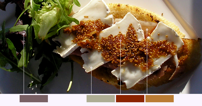
Product design, food and colour

I was recently nosing around on Behance and saw the most amazing food photography, (much better than my effort above, made on a barge whilst partaking in vino and buffoonery with my amigo, The Wine Badger).  What struck me about the behance pictures was how well the colours worked together and how inspirational they were for coming up with colours for products.  I think I should make much more effort in future to get more colour into my designs and not play so safe as most people seem to with white, black and grey with a highlight.  Can't promise this on my next design, but maybe the one after that!