Universal design process Q and A with Maren Fiorelli
 Tuesday, June 11, 2013 at 02:22PM
A while ago I responded to a series of questions about my design process with Maren Fiorelli,
a design student at Columbia College, a slightly edited version of some of my responses is here:
1. What is the first thing you think about when beginning a project?
Once I have identified something I’d like to tackle – a product that I think I can improve on or an area that needs improving, I research to see if this hasn’t already been done, as something better may already exist, but it just hasn’t become mainstream enough to hit my radar and there are few things worse than spending lots of time on something only to have someone tell you that they saw the same design idea or product 4 years ago.
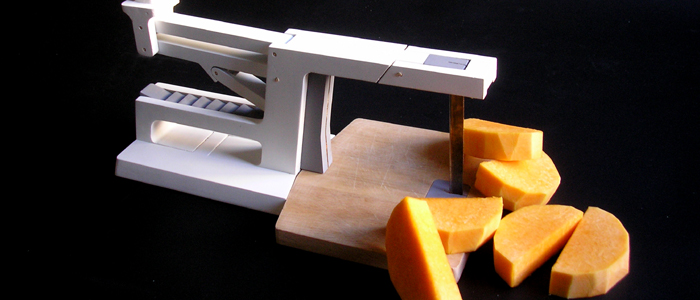
As an example, my Nan struggles to chop vegetables because of weak wrists, as a designer, should I design a better chopping gadget, or order packets of pre-chopped vegetables from the supermarket? There is always another way around a problem, sometimes this is an advantage as it allows you to break away from the norm, other times it is a disadvantage as it means the problem doesn’t really exist. So I have to carefully consider if something is worth tackling as it’s quite an investment of time. I don’t get it right every time either and I do come up with a lot of dead ends. As the image in this post and this video demonstrates:
2. What are some key elements that you try to emphasize in your products?
It’s all about functionality. I have my own design style, but looks are not really important to me, which is weird coming from a product designer as of course I don’t want it to look butt ugly, but one man’s duck is another man’s swan – aesthetics are down to individual taste. If I had to choose between sacrificing looks or functionality, looks would get the chop every time – although I do think the role of the product designer is to balance both. What I am really looking for is an elegant solution, the solution which performs best in the most economical/simple way in terms of materials, functionality etc. It’s hard to describe but you know it when you see it. I will also always try to first solve the problem without using any (electronic) technology as I feel it’s always the most obvious path, too often designers will just stick a motor in something or a bunch of electronics.
For example, recently my mother was moaning because the battery had died in her electronic weighing scales, so she had to go back to her mechanical ones – they work perfectly and will continue to do so long after the battery in the electronic ones has died – if electronics provide a tangible benefit, then they should be included, but often I feel it’s an example of laziness on the part of the designer/marketing department and a needless use of resources to try and get a sale from a public that have been tricked into thinking they need something new – new is not necessarily better.
3. How do you create your master check list for these key elements?
I always create a list of things that I’d like to include, there’s the ‘nice to haves’ and the ‘must be able to do’s’. I (sort of) imagine everything it would be good to have, even if they may be currently impossible, but I think through as many scenarios as I can. Some ideas I put back on the shelf for next time, but all the things that will make the object better, I try to keep. It’s difficult to put into words quite how it works, but I try to include as much common sense as possible.
I also use a rule of thumb for the size of product I’m designing to try and include as many innovations/USP’s (unique selling points) as possible. If what I’m designing is simple (1 part) like a bread board, I’m looking for at least 1 USP. If it’s a complex product then I’m trying to find at least 7 USP’s to make it stand out. These USP’s should not be bolt-ons, so the thing looks like an extra out of the transformers movies, but must be incorporated into the design to add to the functionality as I believe there is no point in being different just for the sake of it when you can be different to the benefit of the product and the consumer.
4. What do you feel about universal design in relation to products for someone with a disability?
There are certain disabilities that require unique and adapted designs tailor made to the individual. What I like most about the principles of universal design is that by making an object as easy as possible to use for the people who would find it the hardest, you improve it for everyone, which has to be a good thing. If everyone is using the same equipment, then it’s one less barrier to being disabled.
5. I see that function is the most important aspect in your designs. How important is it to you to stay within the social norm for products that you create?
There are no revolutions in product design; everything is an evolution on what has gone before. I want my designs to be easily understood and used. I do not want to design objects that require massive instruction manuals. So to a certain extent I am designing things that I hope look familiar, but maybe have an element of surprize, like my pepper mill who’s lid turns into a funnel. I am not looking for people to buy or use my product designs because they are by me (otherwise I would show my face on my site etc which I never do), I would like what I create to be invisible, which means, I want my products to work so well that people don’t notice them. The majority of products function to complete a task – I use a can-opener to open a tin of beans, not because I love opening tins, but because I am hungry. When the can opener doesn’t work I get frustrated, because it becomes a barrier to achieving my goal. I never want my designs to be barriers. All products follow some form of social norm, they are styled for which-ever culture will most appeal to the consumer, which is why so many versions of a product exists. Even something as mundane as a toaster comes in many forms and colours to fit with the styling of your home.
6. What direction do you think that designers tend to overlook when they are designing products?
Mainly I would surmise that most mistakes that are made are caused by aggressive time constraints. Time is money, so there can be extreme pressure to hit a deadline.
I have direct experience of this. I once designed a garlic crush as part of a range of kitchen utensils. I made a solid Bluefoam model that was then realised in CAD and a rapid prototyping model sent back. I, the client and the rest of the office had a look at it and everything seemed ok, but no one tried to crush garlic with it as we would have broken the part. We pushed on with tooling, but on receiving the first off tool samples, I discovered (to my horror) that when crushing garlic the two handles just slightly pinched the skin in people’s hands when fully closed. Changing the tool was costly and no one was very happy, but due to aggressive timescales it was a mistake that no one spotted. I learnt a lot that week;-)
 Product tank,
  QandA,
  advice,
  product design in
  process,
  product design advice


